#image IDs added. my bad
Explore tagged Tumblr posts
Photo
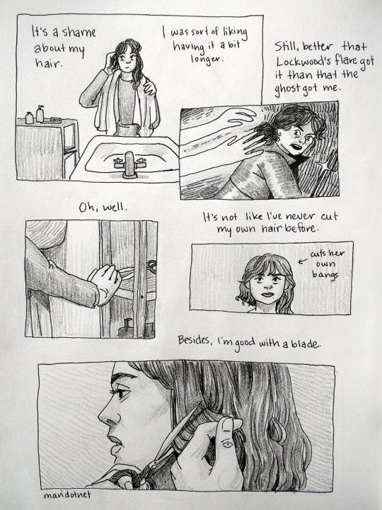
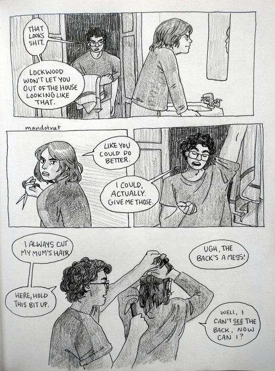


Lucy and George’s friendship is something that can be so personal, actually
ID below cut
[Image Description:
Page 1 Panel 1: Lucy looks in the bathroom mirror, ruffling the side of her hair, which is singed short. “It’s a shame about my hair. I was sort of liking having it a bit longer.” Panel 2: Flashback of her dodging a ghost. “Still, better that Lockwood’s flare got it than that the ghost got me.” Panel 3: She reaches for a pair of scissors. “Oh, well.” Panel 4: She looks in the mirror, at her self-cut bangs. “It’s not like I’ve never cut my own hair before. Panel 5: Lucy starts to close her scissors around a lock of hair. “Besides, I’m good with a blade.”
Page 2 Panel 1: Lucy stares in the mirror, exasperated. Behind her, George is entering the bathroom. George: That looks shit. Lockwood won’t let you out of the house looking like that. Panel 2: Lucy turns to look at him disparagingly over her shoulder. “Like you could do better.” Panel 3: George hangs his towel over the door and holds out a hand. “I could, actually. Give me those.“ Panel 4: George combs half of Lucy’s hair up out of the way, and she holds it. George: I always cut my mum’s hair. Here, hold this bit up. Ugh, the back’s a mess! Lucy: Well, I can’t see the back, now can I?
Page 3 Panel 1: George’s hands, snipping through a section of Lucy’s hair. Lucy: Why not go to a salon? George: Too expensive. I suppose my aunt must cut it for her, now. Lucy: Who cuts your hair? George: Lockwood, mostly. He’s terrible. Panel 2: George and Lucy inspect her hair in the mirror. George: There, that’s the back fixed. Let me know if I missed anything once it’s dry. Lucy, ruffling it: That’s loads better! George: Sound a little more surprised, if you can.
Page 4 Panel 1: George, leaving: I’ll get the broom if you hurry up so I can shower. Lucy, still inspecting her hair: Alright, then. Panel 2: George holds the dustpan while Lucy sweeps hair into it. Lucy: Thanks, George. George: Sure. I’m glad the ghost only got your hair. Lucy: Me, too. End.
End ID]
#lockwood and co#lucy carlyle#george karim#lockwood and co fanart#george is lucky his hair is curly or lockwood's bad handiwork would be a lot more obvious#mari.net art#id added#this is my first time adding an image description to my art#so let me know if there's anything I can do to make it more clear!!
1K notes
·
View notes
Text
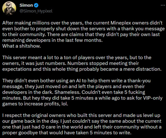
the hypixel/mineplex beef continues even beyond its grave o7
[Image ID: A tweet from @Simon_Hypixel reading:
"After making millions over the years, the current Mineplex owners didn't even bother to properly shut down the servers with a thank you message to their community. There are claims that they didn't pay their own last remaining developers in the last few months. What a shitshow.
This server meant a lot to a ton of players over the years, but to the owners, it was just numbers. Numbers stopped meeting their expectations and this whole thing probably became a mere distraction.
They didn't even bother using an AI to help them write a thank-you message, they just moved on and left the players and even their developers in the dark. Shameless. Couldn't even take 5 fucking minutes. But hey they did take 5 minutes a while ago to ask for VIP-only games to increase profits, lol.
I respect the original owners who built this server and made us level up our game back in the day. I just couldn't say the same about the current one that just had 0 care in the world and left their community without a proper goodbye that would have taken 5 minutes to write."
End ID]
this was a quote retweet of TheMisterEpic's video on what caused mineplex to shut down, which i highly recommend watching
#added an image ID bc it's very easy to add them for tweets but lemme know if the format is bad or anything bc i dont do that very often#i need to do it more often like at least for pictures (i think my descriptions of videos would be very insufficient)#but im usually just posting skyblock and literally like 5 ppl are gonna see it. or sometimes 5000. i never know!#simon hypixel
62 notes
·
View notes
Text
Heres to the blorbos being developed in the background

many such cases
#my ort#no image id#hommade blorbo#employee 414#so I usually tag it as employee or do i just put the number actually?#I gorget#bad art#I've since added some shading but dont worry
4 notes
·
View notes
Text
Went shopping recently

#clothes#pride#pride month#lgbt pride#queer pride#pride 2024#trans pride#happy pride 🌈#coffee mug#mug#equal rights#bad bitch#lgbtq#lgbtqia#lgbtq community#lgbtq positivity#gay clothes#gun image#gun#id added#id in alt text#id included#my photography#photo
6 notes
·
View notes
Text
Seeing as I was already making flashcards for my PSAT prep class, here’s a picture of the front of a card, ft. my horrid handwriting
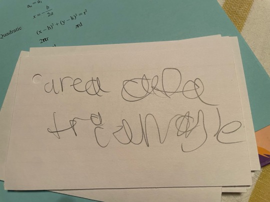
#I added an image id so you can see/hear what it says#yeah that’s my actual handwriting#my handwriting#my handwriting is that bad all the time lol#sorry#Astara rambles#this is for my psat prep class bc we have a formul quiz next week on ten equations but we don’t know which 10#so we have to remember all of them and hope we get it right#bc I have to take the PSAT (again) in October and this class is to help you get a possibly higher score#we have to memorize 65 by October for the PSAT#yayyyy im so excited 😒
0 notes
Text
tommorow is drizzile day
:)
#:)#im sorry if the :) tag makes it seem like something bad is gonna happen just felt like adding it#god i HOPE nothing bad happens tommorow i wanna actually enjoy seeing all the drizzile art on twitter#except id rather not use twitter at all#tbh the only reason im still using twitter is bc of the image share on switch#and for some reason my phone wont connect to my switch and i cant download things directly so i gotta use twitter to download them instead#and i will never download facebook#anyways uhh yeah drizzile day tommorow 11 am in my timezone
0 notes
Text
Fuck AMPTP and the bullshit going on. I'm tired, might not do this well:
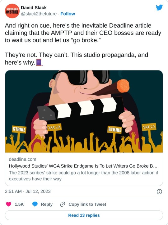
(link to article in above picture) From The Article
Receiving positive feedback from Wall Street since the WGA went on strike May 2, Warner Bros Discovery, Apple, Netflix, Amazon, Disney, Paramount and others have become determined to “break the WGA,” as one studio exec blatantly put it.
To do so, the studios and the AMPTP believe that by October most writers will be running out of money after five months on the picket lines and no work.
“The endgame is to allow things to drag on until union members start losing their apartments and losing their houses,” a studio executive told Deadline. Acknowledging the cold-as-ice approach, several other sources reiterated the statement. One insider called it “a cruel but necessary evil.”
The studios and streamers’ next think financially strapped writers would go to WGA leadership and demand they restart talks before what could be a very cold Christmas. In that context, the studios and streamers feel they would be in a position to dictate most of the terms of any possible deal.
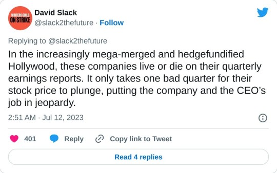
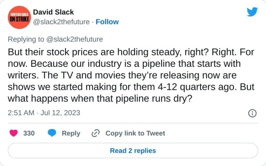
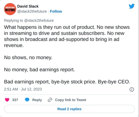
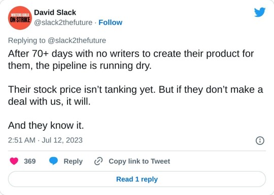
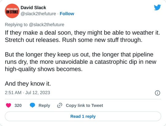
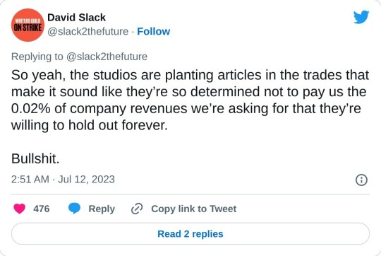
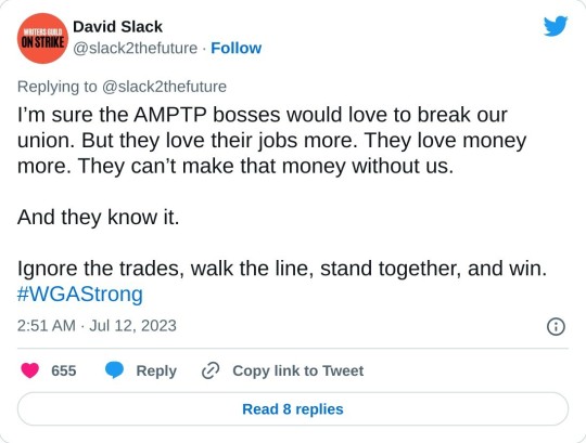
[Image IDs: Twitter thread by David Slack posted July 12th, 2023 that reads in totality:
And right on cue, here’s the inevitable Deadline article claiming that the AMPTP and their CEO bosses are ready to wait us out and let us “go broke.”
They’re not. They can’t. This studio propaganda, and here’s why.
In the increasingly mega-merged and hedgefundified Hollywood, these companies live or die on their quarterly earnings reports. It only takes one bad quarter for their stock price to plunge, putting the company and the CEO’s job in jeopardy.
But their stock prices are holding steady, right? Right. For now. Because our industry is a pipeline that starts with writers. The TV and movies they’re releasing now are shows we started making for them 4-12 quarters ago. But what happens when that pipeline runs dry?
What happens is they run out of product. No new shows in streaming to drive and sustain subscribers. No new shows in broadcast and ad-supported to bring in ad revenue.
No shows, no money.
No money, bad earnings report.
Bad earnings report, bye-bye stock price. Bye-bye CEO.
After 70+ days with no writers to create their product for them, the pipeline is running dry.
Their stock price isn’t tanking yet. But if they don’t make a deal with us, it will.
And they know it.
If they make a deal soon, they might be able to weather it. Stretch out releases. Rush some new stuff through.
But the longer they keep us out, the longer that pipeline runs dry, the more unavoidable a catastrophic dip in new high-quality shows becomes.
And they know it.
So yeah, the studios are planting articles in the trades that make it sound like they’re so determined not to pay us the 0.02% of company revenues we’re asking for that they’re willing to hold out forever.
Bullshit.
I’m sure the AMPTP bosses would love to break our union. But they love their jobs more. They love money more. They can’t make that money without us.
And they know it.
Ignore the trades, walk the line, stand together, and win. #WGAStrong
/End ID]
Bonus: John Rogers' Reaction

[Image ID: A tweet from John Rogers that he posted July 12th, 2023 that reads:
I was trying to be cool and professional about this strike, but this AMPTP “we want to drive them to homelessness” shit means I’m going to be dug in at WB Gate 4 like Hiroo Onada. They’re gonna have to send @ellenstutzman with a bullhorn to order me out of the bushes.
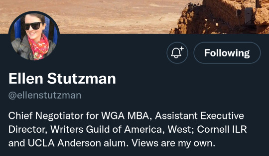
The second image is Ellen Stutzman's Twitter bio that says:
Cheif Negotiator for WGA MBA, Assistant Executive Director, Writers Guild of America, West; Cornell ILR and UCLA Anderson alum. Views are my own.
/End ID]
EDIT: Please see the update on this HERE
4K notes
·
View notes
Text
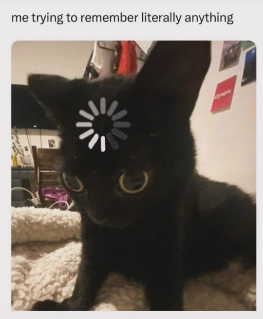
[image ID:
A black cat with its head angled down and its eyes wide, with an almost mile-long stare. As if lost in thought. The progress-wheel is edited onto its forehead.
The caption reads "me trying to remember literally anything"
/end ID]
#me#except my old ass doesn't picture it as the progress wheel#I tell people I'm flipping through my Rolodex#does anyone even know what those are anymore?#I mean in fairness it's a fairly similar image to that progress wheel#An Old on the internet#bad memory#memory problems#cat#includes image#includes image ID#includes image description#described#LycoRogue's added two cents in the tags#reblog
3K notes
·
View notes
Text
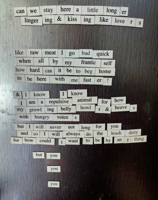
[ID: A poem written using fridge magnets, reading, (when one word is across multiple magnets, I put a - (dash) in between):
can we stay here a little long-er
linger-ing and kiss-ing like love-r-s
like raw meat I go bad quick
when all by my frantic self
how hard can it be to beg home
to be there with me fast-er!
& I know I know
I am a repulsive animal for how
my growl-ing belly howl-s and heave-s
with hungry voice-s
but I will never not long for you
and so I will always do the leash dirty
for how could I want to be by an-y-thing
but you
you
you
/end]
Image ID done by @tootiredforaname and added to main post with permission--thank you so much!
929 notes
·
View notes
Text

One very bad day—when it seemed as though everyone hated her, and as though this were a completely correct way to feel—with bloodied fists and a bruised heart, she wrote a note explaining her suicide then went and unlocked the door. Unexpectedly, this did not kill her; and what did not kill her made her curious. She was much older before she could cross the threshold. [...] When she got there—alive—she could look into the open-faced coffin where lay the reason for her existence. God’s victory and death was a girl. […] Harrow, who had been born for the sole privilege of worshipping this corpse, loved it wildly from sight.
I originally contemplated using the concept of necromancy in the series as the representation for this card, but I decided to go with a figure as The Magician instead of an abstract idea, to match the rest of the Major Arcana. I feel like this scene, as well as Harrow's life as the Reverend Daughter in general, embody the contradictions of this card’s upright and reversed meanings. More thoughts below:
Opening the Locked Tomb led to Harrow crystallizing her life's purpose: to live for the Body and see it awaken. Breaking into the Tomb was a difficult endeavour, requiring skill, willpower, and multiple attempts to make it a reality. I also personally really like how the cliché meaning of the card, "As above, so below," fits metaphorically with the glow worms in the Tomb resembling stars.
This scene also fits the reversed meaning of the card. It shows Harrow at the lowest point in her life, intending to commit suicide, and committing a sacreligious act in contravention of everything she had been raised to believe. This act led to the suicides of her parents and their cavalier. In addition, she was only able to open the tomb not through her own cleverness but also — unbeknownst to her — because of Gideon’s blood under her fingernails.
I got on top of you and choked you till your eyes bugged out. […] You clawed my face so bad that my blood ran down your hands; my face was under your fucking fingernails. When I let you go you couldn’t even stand, you just crawled away and threw up. Were you ten, Harrow? Was I eleven? Was that the day you decided you wanted to die?
ID: A digital collage of "The Magician” tarot card as Reverend Daughter Harrow from the Locked Tomb series. The card shows the scene of Harrow, clad in black and veiled, unlocking the tomb and gazing into the bright blue glow-worm cave beyond. The scene is framed by Gothic columns. There is a broken sword in the lower left. A light above Harrow’s head represents the presence of the Body. Harrow’s silhouette and outfit is from a 1917 ad for Scranton Lace Curtains and an ad for Mariano Fortuny. The cave image is from an 1857 steel engraving of Postojna Cave in Slovenia. The left side of the card shows the upright meaning of The Fool and reads, “Manifestation | Determination | Willpower | Resourcefulness | Creation" in all caps. The right side of the card shows the reversed reading and reads "Illusion | Deceit | Confusion | Bad Intentions | Wasted Talent | Listlessness” in all caps. The base of the card reads "The Magician | Reverend Daughter” in a groovy font.
#suicide mention#suicide cw#tarot#the locked tomb#tlt#tlt fanart#alecto the ninth#ours#gideon the ninth#gtn#harrow the ninth#harrowhark nonagesimus#long post#edited july 7 2024 to add readmore and replace image with slightly less saturated version
95 notes
·
View notes
Note
AITA for tagging posts as inaccessible?
honestly i don't even know how to phrase this. my blog has a very robust tagging system; i tag every character, fandom, etc etc, and try to catch as many triggers and such as possible. i want people to be able to curate their experience on my blog! and one thing I've noticed is that... a lot of people don't add image descriptions to their art, and with the rate i reblog things, my choices are either stop reblogging people's art, ask for an image description to be added and just hope i don't get completely ignored, or add one myself - which works for the most part, but writing up image descriptions for others' art is a pain, and i get fatigued easily, so I can't do that often. instead, i reblog these posts as usual but add two tags - "inaccessible" and "no id."
howerver, recently, a fandom blogger that i admire made a vaguepost. the general gist of what they said essentially falls under "stop harrassing people to add descriptions to posts - if you want to encourage behavior in a community, that's not the way to go about it."
never once have i heard of anyone harrassing people over image descriptions; the closest thing i can think of is people getting backlash for intentionally misusing alt text (in a malicious sense, such as the alt text claiming it is a nice photo of a meadow while the actual image is ableism against blind people. this is an actual example i have seen.), and even then that's clearly not what they were talking about. nobody else in the fandom has ever so much as mentioned image descriptions anywhere, either - literally the only thing i could see their post being about is my tags
I'm really not sure how what i do would count as harassment, though? I'm adding a label that's accurate - "your post is inaccessible." this isn't an opinion, such as "this post is bad." it's saying very frankly that the post isn't fully accessible. OP seemed very upset, however, and i think I've been softblocked???
108 notes
·
View notes
Text
alright, guess we're complaining now.


[Image ID: First image: A cropped screenshot of Tumblr's Friday, May 26th, 2023 changelog which reads, "On web, clicking anywhere in a post’s header now opens that post. Previously, you had to click specifically on the blog name."
Second image: A cropped screenshot of Tumblr's Tuesday, May 30th, 2023 changelog which reads, "To clarify a point made in last Friday’s post: on web, clicking the reblogged-from blog name in a reblog’s post header now takes you to that blog, not their reblog. Clicking in the empty space in the post’s header, and in the header of each reblog trail item, now takes you to that specific post in the blog view popup. This is one of a series of updates we’re making to the reblog consumption experience across all platforms, to make it more intuitive and consistent, especially for new users." End ID.]
Tumblr, this change is bad. A lot of other people have already shared their own complaints for this new and awful system, but it's time for me to properly throw my hat in the ring instead of at-ing you directly due to user error. Whoops.
[UPDATE 6/11/2023] HORRIBLE NEWS, EVERYONE! This change has hit mobile. There is no longer any way to access the previous version of a post except through theme reblog chaining on desktop. I've added some extra fun comments both as an edit to this post and as a reblog so nobody misses out.
All my complaints are in the read more because this got LONG.
TL;DR- This change breaks a major signifier used across the site, removes post functionality only to replace it with redundant blog links, and completely destroys a primary mode of social interaction that's been used on Tumblr for over a decade. Here's the Tumblr Staff support link so you can give feedback on how bad this change is.
Part One: Signifiers and Consistency
This is my biggest point, so it will be a bit of a doozy. Strap in.
This change is about making Tumblr operation 'intuitive and consistent' by unifying behavior between like-designed parts of the site. Now on the face that's not a bad reason to do things, and making sure users are able to intuit what a button does based on its properties is good design. I'll give an example:
Hearts symbolize the 'Like' function on Tumblr. The heart button on a post adds it to your Likes, the Likes option on your account is accompanied by that same heart, and Likes show up in post notes with that heart. This heart, then, becomes a consistent and reliable signifier. If you see a heart button on Tumblr, then whatever it's attached to probably has something to do with Likes.
So, back to the change. This change relates to the signifier of the 'Tumblr blog url link'. The idea is thus- on other parts of the site, such as the Search tab on mobile and on a blog in the dashboard tray, you will see related or similar blog suggestions like these:

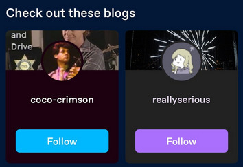
[Image ID: First image: A cropped screenshot of Tumblr's Getting Started help page. It shows an example blog with the 'Blogs like this one' tray visible, populated with four example blogs.
Second image: A second cropped screenshot of Tumblr's Getting Started help page. It shows an example of the Search page on mobile with the 'Check out these blogs' feature highlighted, where two example blog cards are shown. End ID.]
These suggestions are Tumblr blog urls paired with their icon and a little bit of their blog, either the title or some recent posts of theirs. If you click on that url title, the link follows through to that blog. So there's the signifier: click on the url, go to the blog.
But now we have a bit of a snag. What about these?

[Image ID: A cropped reblog screenshot. The crop shows the Tumblr urls of the reblogger @coelpts and reblogged @coelpts-artchives with the reblog symbol between them, the rebloggers icon, and the date that this reblog was posted. End ID.]
Well, these LOOK like Tumblr blog url links. They're styled in the same way. In fact, the reblogger even has a blog icon next to it! So all signs point to these url links pointing directly to a Tumblr blog if clicked on. After this change, that's exactly what they do- so, like, no problem, right?
But, hold on. There's another signifier here! These aren't JUST Tumblr blog url links! This is…


[Image ID: First image: The former image of a cropped reblog screenshot, focused on the urls and reblog icon.
Second image: The Tumblr reblog icon. End ID.]
Our good friend, the Reblog button! That's another classic Tumblr signifier, and it sits right next to the Like button I pontificated about. Reblogs are an integral part of Tumblr, and on top of every single reblogged post you will see that icon. And would you look at that- it's even the same color as the second url link!
Those url links that established the 'url link' signifier that we talked about before, in the search page and on the dashboard tray, aren't attached to any posts. But this url is, and the reblog symbol is right next to it. The reblog signifier modifies the url link signifier. This link should go to the reblog from this user. Right? Because it is a reblog FROM that url link- so that's where it should go! And that's where it used to go, before this update.
[EDIT] I came back to fix some typos I noticed but while I was away I tested mobile to see if this change hit the app yet. It has not, but what I saw instead confirmed the above point- on mobile, selecting the reblogged's url ALSO highlights the reblog icon next to it! These two signifiers are connected, and should be read together.
By changing the url links to be more 'consistent' with other url links across the site, a major signifier that keeps the site together has been broken entirely. What should lead to a reblog- something that is clearly shown through use of a recognizable, consistent symbol- no longer does.
Part Two: Redundant Redundancy
Okay, so that's not all this change does. It also adds a brand new functionality to the post header- the white space is now clickable and serves as a replacement for the original 'to this post' link on the reblogger's side of things. These headers also generate for anyone who adds to the post, and you can click through OP too.

[Image ID: The cropped reblog screenshot from before, but with the word 'Clickable!' written in purple in the blank space above the date. End ID.]
This is also part of that design unity thing; on mobile tapping anywhere on the post header takes you to the post, and you can only tap on the blog url of the person the reblogger reblogged from. That makes sense, since on mobile you're maneuvering your fingers on a small screen and tapping a tiny url next to another tiny url is bound to cause problems.
I don't necessarily have a problem with this on the base of it. I have opinions about mobile and desktop parity that aren't really important here, but it does nicely showcase an issue I DO have- most of the changes made to reblogged posts are completely redundant and unnecessary.
---
[UPDATE] This change has hit mobile now, and it's added a fun new complaint about desktop-mobile parity that is now very suddenly a problem; the headers generated from reblogs with content don't have any responsive feedback for tapping them on mobile. OPs does, but any old Joes doesn't. This is not true on desktop, where on-hover a post header will change color; on mobile they stay completely white and plain with no on-tap color change. On top of that, the new headers are actually harder to see on mobile! There's no clear way to actually see where the header starts and the post continues! Tapping a header was deeply confusing because I got no confirmation I did anything of value until I was wisked away to a post- there's no signifier on mobile that this is a thing you can press.
This is what I was talking about in regards to desktop and mobile parity that wasn't important at the time- what's good for mobile isn't always good for desktop and vice versa. Having a post header be tappable on mobile instead of op's url link, where you have less fine motor control and there's a lot of small buttons clustered together, makes sense; but making all post headers into buttons on desktop isn't a good idea because they aren't 'buttons' and it's very hard to make it clear they are. I mentioned signifiers above and that applies to this change- there just aren't enough signs that show these are all buttons now and where they go. The fact that they're completely unresponsive on mobile really is the cherry on top, because you do not KNOW it's a button unless you tap it accidentally or already know from desktop that all headers link to reblogged posts. The design has been made more confusing; what was a functional affordance on mobile has been applied to desktop without limits or concern, making the original mobile affordance more confusing and producing a poor signifier.
Alright, that's enough from future me. Let's get back to the original post, about how this change that introduces a bad signifier is also redundant.
---
First of all, it's not like clicking the link url just threw you into a post abyss when you clicked it. Clicking through to a reblog…still took you to that blog, both on mobile and on desktop. On mobile all you need to look through the blog proper is to pull down and refresh; on desktop it's even easier, because following a link pulls up the dashboard tray for that blog with the blogs url immediately below their icon.

[Image ID: A screenshot of the previously cropped reblog, now shown on the blog @coelpts. The post is on the left, and the user info card is on the right. End ID.]
This change then removes one step to get to the front of a blogs page, and puts the original longer path on the new clickable header. They go to the same place, the first is just exactly one click faster. You could do the exact same thing by clicking the user icon instead.
But wait! We can get even more redundant! You know what else is standard Tumblr functionality on desktop? The hover card!
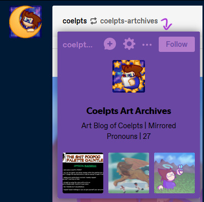
[Image ID: A screenshot of the previously cropped reblog, now showing the card for @coelpts-artchives below the icon. It has the blog title and description alongside three popular posts. A purple arrow points to it from the url. End ID.]
If you hover over any url link for about a second, a card for that blog will pop up. This tray lets you follow a blog, send asks, report them, check their popular posts and do a bunch of stuff straight from the dashboard. It also takes you directly to their blog if you click the url link on the card itself! That's right, there was already a way to go directly to the blog the previous user reblogged from! And every single blog url link does this, too- not just on post headers, but even in the text of a post itself.
So before this change, you had five ways of interacting on a post:
Click the reblogger's url > Reblogger's post.
Click the reblogged's url > Reblogged's post.
Click the reblogger's icon > Reblogger's blog.
Hover on the reblogger's url > Reblogger's blog.
Hover on the reblogged's url > Reblogged's blog.
One of these is redundant, but that's fine- it's just how url links work, and it's better that all urls can do that. Signifiers, we talked about this. But every other link goes to a different place, including the previous version of the post.
After this change, there's six, with changes in bold:
Click the reblogger's url > Reblogger's blog.
Click the reblogged's url > Reblogged's blog.
Click the reblogger's icon > Reblogger's blog.
Hover on the reblogger's url > Reblogger's blog.
Hover on the reblogged's url > Reblogged's blog.
Click the white space header next to a user > User's post.
We now have three ways of getting to the blog of the person who reblogged this post, two ways to get to the blog of the person they reblogged from, ONE way to get to the post, and ONLY if someone added to it!
This change removes functionality and replaces it with needless redundancy. As I said near the top of this section, we could already get to the blog through a reblog link- so all this does is remove getting to previous post iterations.
Part Three: Broken Chains
And hey, let's talk about previous post iterations. Y'know, something that's super important on Tumblr? Different versions of a post float around the site for years- some have been around for a decade or more. And some are only available for one post.
As I'm sure everyone knows, unless a group of tags are peer reviewed and added to the body of the post itself or are appended to the next reblog in the chain, they only exist on that version of the post. This means every iteration of a post is functionally unique, and long before we were given the ability to check the tags on a reblog directly, the only way you could check the tags for a post was by checking every iteration. This practice still exists today with 'prev tags'- users still find it useful to gesture to a previous version of a post and show what other people were thinking or add their own thoughts.
Remember the new redundant links? All that means you can't get to a previous version of a post anymore. Those tags are functionally lost now, unless you dig through that persons blog or through all the notes of a specific post. Sure that may not be a problem for a post with 300 notes or so- but what about 27,000? What about a post that was reblogged three weeks ago? If you're trying to wrangle Tumblr's dodgy search function on the blog itself, what if the post has no text to search for, or if the blog has it's search function turned off? Any post tagged with prev tags now directs to literally nothing. Anyone arguing or conversing in the tags is now speaking at air to everyone else.
There is still one way to trace reblogs. You can access the blog itself- not the dashboard tray, but the actual url.tumblr.com blog- by using a hidden link in the meatball menu off the side of the post.

[Image ID: A screenshot of the previously cropped reblog, now showing the meatballs menu accessed. The first option, showing the date of the reblog, is highlighted. A purple arrow points to this option from the meatballs menu icon and a circle is drawn around it. End ID.]
From there, you can track a post backwards through proper blogs. The reblogged posts will have a 'via Blog' note on them, and you can follow that trail all the way up a chain.
…Unless someone doesn't have a theme enabled. Without a theme, a user won't have a url.tumblr.com domain and it will redirect to the dashboard tray, breaking the chain. And, as of an older update, blogs by default do not have themes enabled- so any and all new users suddenly roadblock this process. Oops.
All of this means that what was once a convenient social aspect of Tumblr has been completely severed with little to no alternative. Trying to wade through hundreds upon hundreds of notes to find the one you're looking for is tedious, time consuming, and potentially impossible if the post is large enough.
Finale: What Now?
Right, so- this sucks. I didn't even go into how this makes it tough to find and block cr/pt/t/rfs if a post passes into their hateful space, or how this makes it harder to copy post links without tracking shit because it's in a different menu now, or how it's now more difficult to access a previous post for reporting purposes. All that shit's also true, but they're side effects of the big three problems the changes introduce.
This change is ultimately user-hostile and seems to follow the worrying trend of 'other sites are doing it, so let's do it too!' Tumblr's been kicking about recently. Tumblr Live, the new change to images and videos, gating viewing posts behind making an account, and attempted algorithm feeds through 'Best Stuff First' and 'Based On Your Likes' are what immediately come to mind. Tumblr's defining, driving aspect for it's continued existence has and always will be its uniqueness. Pretending to be Instagram and TikTok and fucking Twitter will do it absolutely no favors- all it does is undermine what actually makes this site, as a social platform, interesting and vibrant.
But it's one thing to just complain and it's another entirely to provide feedback. Here's a link to the Tumblr Staff support page. They've walked back on new features before when we've made a ruckus- the Shop icon replacement is on the forefront of my mind right now- so it's time to make another.
TL;DR 2- This change makes browsing Tumblr more difficult than it needs to be. It breaks previously established signifiers and removes vital social functions only to add redundant and empty features to cater to a new userbase instead of actually improving the site for the users they already have. It's not a good change.
Thanks for reading ✌️
#tumblr update#staff#support#i highly doubt i'm the only person whose thrown its hat into the ring#but the more posts we have on this bullfuckery the better i say!#at the very least my dear mutuals will be able to see it#and honestly i needed to get this off my chest. it ruined my sleep last night
337 notes
·
View notes
Text
Bill Collins and Self Curruption
I've had this personal theory ever since the ninth episode of Urbanspook released that, in short, Bill Collins was willing to enter this lifestyle with Mona at the beginning. Of course, this relationship (both as killer and as lovers) was incredibly one-sided at the end with Mona taking full control of Bill's every thought and action, but I have a hard time believing Bill was forced into this at the very start.
Bill Collins is by all means an American Joe-Schmoe; he has an honorable career in his local police force, he has a wife, he has children, he has that white picket fence type dream that every man strives for. Yet, despite all that, there comes a major catch: predictability. No matter how one obtains this nuclear family life it all runs upon the same script. No matter what he has to implement himself in events like anniversaries, holidays, family, vacations, school related events, that obligatory family drama, and don't get me started about the added stress of having to focus on paying taxes, the mortgage, what will and what won't insurance will cover, what trouble his kids caused, how much a new car repair will cost, and so forth and so forth. This American dream becomes a living nightmare once you have to juggle money and family relations that, at the end of the day, will amount to nothing and will never end with your deeds being thanked.
It's a monotonous life that I can't see a person like Bill Collins enjoying. At most, he would have forced himself into a delusion of enjoyment due to societal pressures and the need to abide by normalcy. This is all something he could never control so, to go completely against such routine, is the ultimate form of freedom. To live his life vicariously through his primal id with the removal of social and familial obligations isn't that insane of a concept for a middle aged man to commit. Yet, we are swayed to believe that he could never commit such actions. We, the audience, are fed this idea of "honor" and "respect" despite the lack of evidence outside of his job title as a police officer.
This goes into my next point: he became a police officer for purely selfish reasons that had no relation to protecting the community he works for. I know, shocker; a bad police officer. I won't baby feed anybody on how corrupt the police system in America is, so I'll just focus more on the specifics of Bill Collins' career. Despite the gritty reality, we are told this idea of the police. We are told that an officer of the law can't be just anyone, but someone dedicated to the people. Someone who will put their life on the line to bring peace and justice when the citizens couldn't. We are told that this title is something only morally correct people can obtain. Bill very much goes against this ideology. I have a hard time believing that someone that easily became a bloodthirsty hedonist was a good cop to begin with. In fact, I am inclined to believe his desires for violence poked its head while on the line.
Maybe Bill found himself jumping to physical restraint and assaulting suspects with weapons much quicker than his colleagues. Maybe he even jumps to the most drastic measure for small incidents like speeding or running a red light. Hell, maybe he seriously injured a convict for "justifiable reasons". Whatever it may be, violent tendencies don't pop out of nowhere for a person and a man that's in an environment that not only allows physically harming suspects, but encourages it isn't too far fetched. This could even go deeper if true with his actions being easily covered up by the department due to either image, his attitude and charisma, him being able to get his job done no matter what or a mix of all three. With such a small town, it would be a disaster if one or more officers were openly tried for misconduct and assault so it would be better to look the other way. We can't have the perception of the "good, morally correct cop" being questioned.
The final point I want to cover is how convenient everything went in his favor once he and his family got affected by Mona. Think about it: he is spared from being killed, has had major pieces of evidence that pointed towards him being involved was destroyed (his car being abandoned in the ocean) or cleaned away (there was no mention of fingerprints or further murders besides hi infant once his house was investigated), and how he of all people obtained the killer's self portrait right before his home invasion. It's hard to believe Mona spared him nor that she would easily overpower a man like him, even with a weapon on hand. I'm inclined to believe he jumped at the opportunity to execute his family with Mona perhaps due to a spur-of-the-moment decision or a premeditated one crafted beforehand. Either way, the actions following didn't seem to benefit Mona in the slightest. Why would she destroy and abandon Bill's car? She never seemed concerned about leaving her prints behind nor was it going to deter the police away from her scent due to its placement by the lighthouse. If anything, it hindered her since she had to go about abandoning a car without the plate being read nor noticed in such a small town. The only reason she would need to get rid of the vehicle is if she wanted to wash away and hide incriminating evidence against Bill.
We can further inspect this theory by looking at Mona's first painting of Bill. The painting is incredibly interesting in how it depicts a supposed victim due it being one of the most simplistic portraits so far (even "Scream Maggy Scream" had deep violets and hints of pink) with it being only black and white with the face itself being a cartoonishly bland one with two small eyes and a tiny smile on an elongated face. It doesn't show him being tortured nor in any sort of distress. It doesn't even have a puny title alluding to his demise with it just being dubbed "Bill Collins" (of course there is no sign of her giving it an official name so even assuming its named after Bill would be a stretch). With a quick glimpse it has a lot of striking resemblance to how Mona appears: pale skin, very smooth features, sunken in eyes, and a very simple yet off putting representation of human emotions. The only major difference is that he's popularly shown smiling, before and after Mona's involvement. It's safe to assume Mona is trying to reveal how similar she sees Bill and herself, from either actions, personality, or a mix of both.
Now, the series isn't finished so Mona's reasoning for attacking the Collins family can easily go against everything I said. Maybe it all was just a coincidence and Bill really was that sweet hearted Joe-Schmoe. Maybe the painting towards him was made just to poke fun at how he looks and nothing more. Only time will tell. But, all and all, I believe Bill had a much bigger involvement than we are led to believe and is no better than Mona when it comes to that lust for sadistic torture.
26 notes
·
View notes
Note
https://www.tumblr.com/stoptheantisemitism/763524232272592896/what-no-illegal-land-sales-happening-in-your
https://www.tumblr.com/stoptheantisemitism/763524236034932736/whats-holding-you-back-no-illegal-settlements

ID 1: A screenshot from a Tumblr feed featuring a post by the user 'stoptheantisemitism'. The post contains a reblogged comment from 'battyhillel' stating 'i can't wait to move to israel...', followed by a response questioning the decision and implicitly critiquing illegal land sales. This response includes hashtags such as #Absolute garbage human being. The post has 19 notes and options for liking, reblogging, or replying are visible. Below the Tumblr thread, there's an ad from Netflix showcasing an image of a person against an orange background.

ID 2: A mobile screen displaying a Tumblr post conversation at the top and a Netflix advertisement at the bottom. The Tumblr post originates from the user 'stoptheantisemitism', and includes an interaction with two comments. The first comment, by 'batyhilel,' expresses eagerness to move to Israel, followed by 'stoptheantisemitism' asking what's holding them back, and inquiring about illegal settlement sales. The post has 19 notes, with options for reactions like reblogging, commenting, and liking. Below the Tumblr post, a Netflix ad promotes 'Heartstopper Season 3', featuring a close-up of a person's face with text 'I THINK YOU...' The layout shows typical social media interaction, blending cultural discourse with entertainment marketing.
Literally in response to me wanting to move to israel…
alright then, lets see their blog, shall we?

ID 3: A social media profile titled 'Zionism is Anti-Semitism' is displayed, featuring a Star of David symbol against a blue and pink circular backdrop. The profile description beneath reads, 'Ethnically Jewish. Come unlearn Zionist Propaganda with me They/Them 27 CT.' Below the title is a prompt button labeled 'Ask me anything.' Two images are included on the profile; one shows text seemingly related to racial or ethnic conflict, and the other appears to show a group of people in physical distress. A blog entry below by a user named 'rimchan' expressed frustration over the comparison of different acts of terrorism, mentioning historical World War II events.
Unironically calling zionism antisemitic
cool /sar.
I can’t with this website forreal.
OH them!
I'm so sorry my nemesis found you
my nemesis the person who somehow the SAME pronouns and the SAME age. They tried to steal my "identifies canards as antisemitic gimmick" tried to get a similar name to mine. They are trying to be knock off antizionist me
when like I DON"T engage nazis and pro-pals in debate, I am an archive of blocking, the are a archive of "jews to harrass by their tankie audience"
and has 4 different ban evade accounts one of which is just "receipts of my 'genocide apologia'". Said 'genocide apologia' is me correcting their misinfo and calling them out
you heard it here first, calling out another jew is LITERALLY the holocaust
Block them and their alts
innocent-fandomite
innocent-fandomite-hater
stop-the-antisemitism
and of course
spot-the-antisemitissm
because the second s implies that I'm a nazi
yes I'm the nazi and not the nazi shit they post on their kahanist alt to make Jews look bad
#blocklist#harassment#leftist hypocrisy#leftist brainrot#antisemitism#leftist antisemitism#tankie punks fuck off#unhinged#holocaust inversion
24 notes
·
View notes
Text
MURDER DRONES ART DUMP
Most of this is simply trying out style stuff and whatnot
Sorry if the camera quilty is kinda bad, the light in my room isn't the best for pictures haha. I'm also adding descriptions for these! I'm not really good at Image IDs but I'll try my best here.

A pencil drawing of Cyn and Uzi from murder drones. The two are smiling at the camera and leaning their heads on their respective sides. (Left for Uzi and Right for Cyn) Uzi has one eye closed and a more sheepish expression on her face Cyn has an open mouth smile and seems very happy. (NOT A SHIP. i REPEAT. NOT. A SHIP. think of it like two seperate situations.)

2. A pencil drawing of my oc 7! Their face is glitchy and their is oil or drool dripping from their wide sharp grin. they seem to be blushing as well. their expression is slightly crazed, or over excited for something. they are breathing heavy, which is innfered by the coulds of breath.

3. An anatomy and height practice of N and J. J is on the left while N is on the right. They are both standing and facing the camera. J has her right(Camera's left) Hand on her hip. N has his left(Camera's right) hand waving at veiwer. This was mainly drawn for height and anatomy practices.

3. Another Pencil drawing. This time of N standing pigeion toed and slughtly hunched. his right arm is lifted up and his hands are swaped for bladed fingers. his blades are dripping with oil and he looks rather menacing. his hair is ruffled. Instead of his normal eyes, his screen displays a large '><' his mouth is contorted into a wide, sharp toothed smile.

4. Notes! I'm not going to try and make an ID for this one (Sorry!) But if anyone would like to try their hand at it Please do! these are just overall notes and how-tos on drawing. Kinda a personal reference.
#my art <3#silly#murder drones#my art#murder drones art#n murder drones#goofy#Md#J md#J murder drones#murder drones J#Md J#serial designation n#serial designation J#illustration#artwork#drawing#traditional art#art dump#penicl art#murder drones <3#art#art tag#drawings#sketchbook#pencil#pencil drawing#sketch
54 notes
·
View notes
Text
this post is about what has been going on recently with the managers and stuff. ill be repeating my original claims with evidence and also be adding some new claims.
first off, i would like to say that my original post wasn’t supposed to be hateful. no matter what people tell you, i am not a bad person, spreading rumors or misinformation, or anything like that. i also made the post to try to help the gaehive, not to harm anyone. i knew posting about this would ruin my reputation among some people, so i’d like you to know that while i may have made some choices that weren’t the best out of anger, i also struggle with understanding tone and writing in a specific tone.
with brook, i accused brook of not updating thumbnail ids and being biased towards people that they like. i still agree with both of those things. brook has not been updating or has been writing insufficient thumbnail ids. i absolutely understand the struggle with having adhd and not being able to do something that you don’t want to. but there are so many better solutions than just not updating the id. you could ask someone else to do it for you, you could not update the thumbnail until you have the motivation to, if you have access to medicine you could use medicine that helps with that, you could write thumbnail ids and save them when you first make them, there’s so many better ways to do this than just not doing it. and about the bias, for example, my friend carbon was asked to not return to the gaehive for ban evasion, when brook and some of the other managers have ban evaded in the past. that’s just one example, unfortunately i can’t remember any more currently but i know there are more.
here are some examples of brook not updating thumbnail ids for proof:


about chaos: chaos is a proshipper, which is defined as someone who supports all ships, including ones like child x adult ships. this part cannot and should not be denied, it is a fact. chaos literally says it themself. this is pretty creepy especially considering that the gaehive is a studio full of kids, who shouldn’t be looking at stuff like that. it’s not that chaos’s content like that is hard for gaehivians to find, its tumblr which links to some of the fanfiction theyve made and proship content is reblogged and liked on, has been shared on the gaehive and the account has posted in the gaehive and hiveblr tags. + it follows a lot of gaehivians. i don’t want people to debate me on if proshippers are bad or not in the replies, i have already had several debates about this, im fine with asking simple questions just no arguments.
anyways, here is some proof that chaos is a proshipper:

you can also see more proof in chaos’s likes here although to find some of the worse stuff youll have to scroll a little (edit: archive.org was being a bitch and archived chaos’s tumblr itself and not the likes page, i don’t know how to fix this. for now ive made an ibb album with more images for proof but they dont have chaos’s tumblr in the frame so if likes are made private the proof will be gone)
i may make a post about jord too if the people involved agree
anyways, no arguing in the comments please. you can debate me on discord if you want an actual serious debate
23 notes
·
View notes